
- 1. Ant Design — The Leading Enterprise Design System from Alibaba
- 2. TDesign — The Comprehensive Design Ecosystem from Tencent
- 3. Semi Design — The Douyin/TikTok Design System from ByteDance
- 4. Arco Design — The ByteDance GIP UED Team Design System
- 5. NutUI — JD-Style Mobile Component Library
- 6. Naive UI — The Vue 3 Component Library from TuSimple
- 7. Mand Mobile — Finance-Specialized UI Toolkit from Didi
- Comprehensive Comparison Table
- Conclusion
1. Ant Design — The Leading Enterprise Design System from Alibaba
Ant Design is the most famous and influential design system from China, developed by the Ant User-Experience Design Team at Alibaba. It is a comprehensive design ecosystem for enterprise-level products, with over 90+ professional React components trusted by millions of developers worldwide, including Alibaba, Tencent, Baidu, Xiaomi, Meituan, Didi, and thousands of Fortune 500 companies.
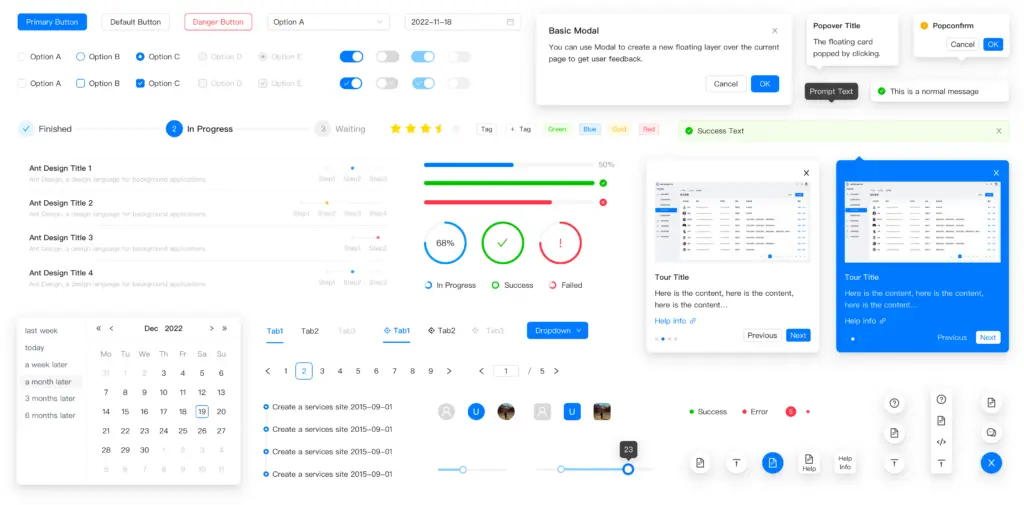
What sets Ant Design apart are its four core design values: Natural, Certain, Meaningful, and Growing. This philosophy makes Ant Design not just a component library but a consistent design language that minimizes redundancy and excessive production costs while helping designers focus on better user experiences. Ant Design provides comprehensive design resources from design patterns, visualization guidelines, illustration styles, to Sketch toolbox and in-depth articles.
Technically, Ant Design uses React as its primary framework, but the community has developed versions for Angular (NG-ZORRO), Vue (Ant Design Vue), Blazor (AtomUI), and many other frameworks. In 2025, Ant Design launched Ant Design X — a next-generation component set for AI-powered applications, marking an important milestone in the AI era. The official website also integrates AI Generate Theme, allowing users to create custom themes from natural language descriptions.
2. TDesign — The Comprehensive Design Ecosystem from Tencent
TDesign is a comprehensive enterprise design system built by Tencent through internal open-source collaboration. Before 2019, Tencent operated multiple separate internal design systems and component libraries, leading to fragmentation. In 2019, Tencent established the Open Source Collaboration Committee, organizing teams working on similar technology products to collaborate. TDesign is the result of this collaboration between frontend and design teams.
TDesign stands out with its cross-platform and multi-tech-stack capabilities. Currently, TDesign fully supports popular frameworks: Vue 2, Vue 3, React for desktop; Vue 3, WeChat Mini Program, React, Flutter, and UniApp for mobile. This allows teams to build consistent applications across multiple platforms with the same design language. TDesign also provides 1,580+ products from various industries, from consumer products to financial services, from B2B to B2C.
In terms of design resources, TDesign provides Figma, Sketch, Adobe XD files and supports usage on CoDesign, Pixso, Jishi Design, and Modao. TDesign’s Design Token system allows easy style expansion to meet brand customization needs. Notably, TDesign offers the TDesign Starter Kit to help developers quickly start new projects with ready-made templates. With over 1,000+ closed issues and 5,000+ code reviews in the past year, TDesign maintains a weekly release cycle, ensuring high quality and stability.
3. Semi Design — The Douyin/TikTok Design System from ByteDance
Semi Design is a modern design system developed by Douyin’s frontend and UED team at ByteDance — TikTok’s parent company. It is one of the pioneering design systems that integrated AI-friendliness from the ground up, with over 80+ high-quality components and more than 3,000+ Design Tokens.
Semi Design’s most unique feature is its Design to Code (D2C) and Code to Design (C2D) capabilities. With D2C, designers can convert Figma design drafts into actual code in seconds. With C2D, the system automatically generates Figma UI Kits based on different themes, ensuring consistency between design and code. This effectively bridges the gap between DesignOps and DevOps.
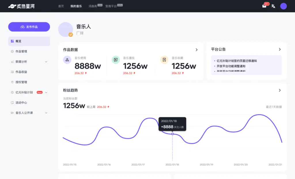
Semi Design also places strong emphasis on Accessibility (A11y), fully complying with W3C standards for keyboard interaction, focus management, and ARIA across all components. The system fully supports internationalization with dozens of languages, timezones, and RTL (Right-to-Left). Architecturally, Semi Design uses a Foundation/Adapter architecture, making code easy to read and contribute to. Available themes include Semi Design Default, Feishu Universe Design Theme, Douyin Creator Theme, CapCut Theme, and Volce Engine Theme, demonstrating flexibility for multiple products within the ByteDance ecosystem.
4. Arco Design — The ByteDance GIP UED Team Design System
Arco Design is another enterprise-level design system from ByteDance, developed by the GIP UED team and Infrastructure FrontEnd team. Arco Design is built on a philosophy based on four values: Consistent, Rhythm, Clear, and Open. With over 70+ React components and Vue 3 support, Arco Design focuses on providing comprehensive design and development solutions for enterprise products.
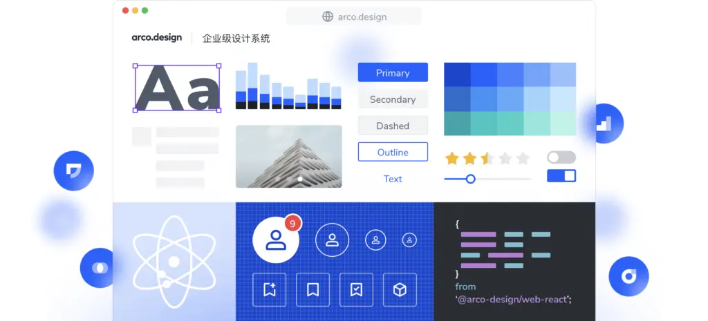
Arco Design stands out with its rich tool ecosystem including: Arco Design Lab — a multi-dimensional style configuration platform; ArcoPro — an out-of-the-box UI solution for enterprise applications; Palette — a color configuration tool; IconBox — an icon platform; and Material Market — a material marketplace. Arco Design’s Design Token system stores “design decisions” as JSON files, including text color, background color, border color, font size, spacing, border radius, etc.
Arco Design also has a unique Material system, dividing resources into three levels: Components (basic components), Blocks (combinations of multiple components, more complex), and Pages (complete pages). This helps teams efficiently reuse complex business logic modules. Arco CLI supports developers in quickly creating material projects, publishing, and managing materials. Currently, Arco Design has served 4,000+ projects with total downloads exceeding 210 million.
5. NutUI — JD-Style Mobile Component Library
NutUI is a mobile component library in JD (Jingdong) style — one of China’s largest e-commerce platforms. With over 80+ high-quality components, NutUI is designed based on JD APP 11.0 Visual Specifications and supports multiple platforms: H5, WeChat Mini Program, Alipay Mini Program, JD Mini Program, and Taro-H5.
NutUI’s strength lies in its write once, run anywhere capability. Developers can use the same Vue 3 codebase to build applications running on both H5 and multiple types of mini programs, significantly reducing cross-platform development costs. NutUI also supports TypeScript, Server-Side Rendering (SSR) in beta, and custom themes with over 700+ available style variables.
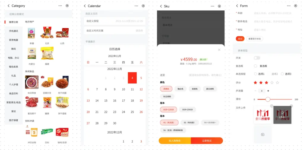
In terms of quality, NutUI achieves over 80% unit test coverage, ensuring high stability. Beyond basic components, NutUI also provides specialized business components such as NutUI-Cat (components for major sale seasons) and NutUI-Bingo (components for lucky draw programs), reflecting deep understanding of e-commerce needs. NutUI also has a React version with 70+ components, expanding its user base. The name “Nut” is inspired by Scrat the squirrel from the movie Ice Age — a symbol of persistent pursuit of goals.
6. Naive UI — The Vue 3 Component Library from TuSimple
Naive UI is a component library developed by TuSimple — a company specializing in autonomous vehicles. It is one of the most popular Vue 3 component libraries with over 90+ components, written entirely in TypeScript and optimized for high performance.
Naive UI stands out with its advanced type-safe theme customization system. Unlike other libraries requiring CSS preprocessors or webpack loaders, Naive UI allows developers to customize themes simply by providing a theme overrides object in JavaScript. All components are tree-shakable, helping reduce bundle size. Data-heavy components like Table, List, and Select all integrate virtual lists by default, ensuring smooth performance even with thousands of items.
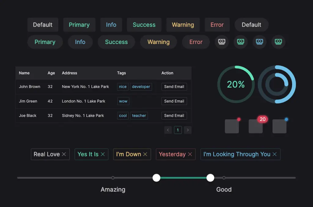
Naive UI does not require CSS imports — styles are managed internally through CSS-in-JS, saving developers configuration time. The Naive UI community is very active with multiple DingTalk chat groups already full (from group 1 to group 6), showing high popularity within China’s developer community. Naive UI also provides Sketch design resources, helping designers and developers work in sync. With the philosophy of “Fairly Complete, Theme Customizable, Uses TypeScript, Fast,” Naive UI is the ideal choice for Vue 3 projects requiring high performance and flexible customization.
7. Mand Mobile — Finance-Specialized UI Toolkit from Didi
Mand Mobile is a mobile UI toolkit developed by Didi Chuxing — “China’s Uber” — and is specialized for financial scenarios. Based on Vue.js 2, Mand Mobile provides rich components covering most financial situations: payments, transfers, account management, investments, insurance, and other financial services.
Mand Mobile’s design follows a flat design style — clean, simple, helping users focus on complex financial content. Mand Mobile’s philosophy is to “simplify complex scenarios and help users improve awareness and efficiency.” This is crucial in the financial sector, where users need to clearly understand information before making decisions.
Mand Mobile provides a template project through vue-cli, helping developers quickly initialize new projects. Components support on-demand import through babel-plugin-import or ts-import-plugin, helping optimize bundle size. Beyond basic components, Mand Mobile also provides development support tools such as DoraemonKit — a comprehensive app development support toolkit for iOS and Android, and Chameleon — a cross-platform MVVM framework (Web/Weex/Mini program). Mand Mobile is licensed under Apache License 2.0, allowing free commercial use.
Comprehensive Comparison Table
| Design System | Company | Framework | Component Count | Key Highlights |
|---|---|---|---|---|
| Ant Design | Alibaba | React (primary), Vue, Angular | 90+ | Enterprise-class, AI-friendly, 4 design values |
| TDesign | Tencent | Vue 2/3, React, Flutter, Mini Program | 60+ | Cross-platform, multi-tech stack, 1,580+ products using |
| Semi Design | ByteDance (Douyin) | React | 80+ | Design to Code, 3,000+ Design Tokens, AI-friendly |
| Arco Design | ByteDance (GIP) | React, Vue 3 | 70+ | Material system (Component/Block/Page), 210M+ downloads |
| NutUI | JD.com | Vue 3, React | 80+ | Mobile-first, cross-platform (H5 + Mini Program) |
| Naive UI | TuSimple | Vue 3 | 90+ | 100% TypeScript, tree-shakable, virtual list |
| Mand Mobile | Didi | Vue 2 | 40+ | Finance-specialized, flat design |
Conclusion
The 7 Chinese domestic design systems above represent three major trends in China’s product design and development industry:
First, deep specialization. Each design system is not just a generic component library but is tailored for specific domains: Ant Design for enterprise, NutUI for mobile e-commerce, Mand Mobile for finance, Semi Design for content creation. This reflects deep understanding of user needs in each industry.
Second, cross-platform is mandatory. Leading design systems like TDesign and NutUI all support multiple frameworks and platforms (web, mobile, mini program, Flutter), reflecting the reality of China’s fragmented application ecosystem where WeChat, Alipay, JD, Douyin, and many other platforms coexist.
Third, AI and automation are shaping the future. Semi Design with D2C/C2D, Ant Design with AI Generate Theme, and other design systems are integrating AI more deeply into the design workflow. This is a trend that Western design systems are also pursuing, but Chinese competitors are advancing very rapidly.
Whether you are a designer, developer, or product manager, studying and learning from these design systems will provide new perspectives on building large-scale design ecosystems, balancing consistency with flexibility, and integrating the latest technology into the design process. This is why Chinese design systems are increasingly gaining attention and adoption from the international community.







Comments