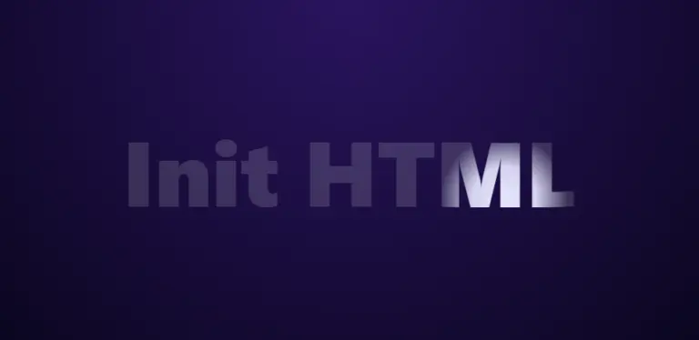
In this article, we will build a spotlight text effect using only CSS Mask and vanilla JavaScript. The solution is lightweight, smooth, easy to customize, and fully compatible with modern browsers.
Demo Effect
HTML
The HTML layer is responsible for defining the visual structure of the spotlight effect. We wrap the content inside a UIkit card to keep the layout clean and reusable for blog posts or landing pages. The text element uses a data-text attribute, which allows CSS to render the highlighted text via a pseudo-element.
<div class="spotlight-card uk-card uk-card-default uk-card-body uk-text-center">
  <div class="spotlight-wrap">
    <span class="spotlight-text" data-text="Init HTML">Init HTML</span>
  </div>
</div>
CSS: Creating the Text Layers and Light Mask
The effect is achieved by stacking two text layers: a dim base layer that is always visible, and a brighter layer that is revealed through a radial-gradient mask. The center of the gradient is controlled using CSS custom properties, which are updated dynamically by JavaScript.
.spotlight-card {
  background: radial-gradient(circle at top, #2a145f, #0b0620);
}

.spotlight-wrap {
  position: relative;
}

.spotlight-text {
  display: block;
  position: relative;
  font-size: 120px;
  font-weight: 800;
  color: rgba(255, 255, 255, 0.15);
  cursor: default;
}

.spotlight-text::after {
  content: attr(data-text);
  position: absolute;
  inset: 0;
  color: #e6e6ff;

  mask-image: radial-gradient(
    circle 120px at var(--x, 50%) var(--y, 50%),
    rgba(255,255,255,1) 0%,
    rgba(255,255,255,0.9) 35%,
    rgba(255,255,255,0) 70%
  );

  -webkit-mask-image: radial-gradient(
    circle 120px at var(--x, 50%) var(--y, 50%),
    rgba(255,255,255,1) 0%,
    rgba(255,255,255,0.9) 35%,
    rgba(255,255,255,0) 70%
  );

  pointer-events: none;
}
JavaScript: Tracking the Mouse Position
JavaScript is used to capture the cursor position and convert it into percentage values relative to the text element. The vertical position is slightly offset upward to create the illusion that the light source is shining down from above rather than sitting directly on the cursor.
const text = document.querySelector('.spotlight-text');

document.addEventListener('mousemove', (e) => {
  const rect = text.getBoundingClientRect();

  const x = ((e.clientX - rect.left) / rect.width) * 100;
  const y = ((e.clientY - rect.top) / rect.height) * 100 - 10;

  text.style.setProperty('--x', `${x}%`);
  text.style.setProperty('--y', `${y}%`);
});
Customization and Extensions
This spotlight effect can be easily adjusted without changing the core structure.
- Increase the light size by enlarging the
circleradius - Soften the light by extending the gradient fade area
- Change the highlight color to match your brand identity
- Use
requestAnimationFramefor even smoother motion
Conclusion
The mouse-following spotlight text effect is a lightweight and visually striking UI solution for modern websites. By combining CSS Mask with simple JavaScript, you can deliver a high-impact interactive experience without sacrificing performance or maintainability.


Comments