
Table of Contents
To access it, go to Init Manga → Appearance. Note: You must activate your license before saving any changes.
1. Appearance & Branding
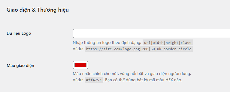
- Site Logo Data
Enter in the format:URL|width|height|class
Example:https://site.com/logo.png|200|60|uk-border-circle
Gives you full control over logo display without needing extra CSS. - Theme Color: Main accent color for buttons, borders, hover effects, and UI elements. Example:
#ff4757.
2. Homepage Layout
- Homepage Style – Choose between:
- Default (Two Column Layout): includes sidebar.
- One Column (Centered Layout): full-width, minimal.
- Novel Label Text
Display label for novel content. Leave empty to disable.
Examples:Novel,LN,Light Novel,Web Novel. - Hot Genre Display: Choose a genre to feature in a “Hot [Genre]” block on the homepage, sorted by views. Select “Disable” to hide it.
Note: Hot Genre is not available when using the Default (Two Column) layout; switch to One Column to enable it. - Slider Mode – Source for the homepage slider:
- Top View (all time)
- Trending (fallback to Top if data is missing)
- Newest (recently added)
- Slider Layout – Display style of the slider:
- Square (1:2:1)
- Square (3:4:3)
- Carousel
- Slider Item Limit: Number of manga items to show in the slider (default: 10).
- Personalized Homefeed: Enable personalized sliders (Similar Reads / Suggestions / Finish Reminders) for logged-in users.
- New Chapter Badge: Show a “New” label for recently published chapters on the homepage and manga listings.
3. Single Manga Page
- Page Layout Style – Choose layout for the manga detail page:
- Default (Single Column Grid)
- Large Image (Big Cover Display)
- With Sidebar (Grid + Sidebar)
- Cover Split Layout: A new layout for single manga pages: displays the cover on the left and manga info with tabs on the right, using a clean two-column structure.
- Cover Image with Padding & Background: Add padding around the cover and use a blurred version as the background for a cleaner look (applies to Cover Split only).
- Show Chapter Cover Images: Displays the first detected image from each chapter as a thumbnail (only applies to Comic manga).
- Related Manga Mode – How to determine related manga:
- Search Related by Title
- Same Genre
- Same Translation Group
- Same Author
- Show Related on Chapter Page: Display related manga block at the bottom of chapter pages to keep readers engaged.
4. Chapter Reader
- Reader Style: Currently, only Default (Standard Reader) is available. More styles will be added in future updates.
- Show Chapter Intro Block: Show an optional intro section before the main content with image, title, and author/team. You can disable it for a cleaner reading experience.
- Image Optimization: Optimizes chapter images by automatically converting them to WebP format, reducing file sizes by ~40% and improving load speed.
5. Display Options
- Grid Display Mode
- Default (standard size)
- Compact (more items per row)
- Show Manga Card Stats: Displays view count, follows, and ratings as an overlay on the manga cover. Turn off for a cleaner UI or custom design.
6. Reader UX Enhancements
- Continue Reading Suggestions: Sticky block at the bottom of the screen suggesting what to read next. Only for logged-in users. If closed, it hides for 1 hour.
- Swipe to Show Chapter Navigation: On mobile, swiping left/right shows previous/next chapter buttons. Does not auto-navigate.
- Sticky Chapter Navigation Bar: Fixed bottom bar while reading chapters. Includes buttons for homepage, manga info, chapter list, config, and nav.
- Back to Top Button: Floating button on all pages to quickly scroll to top.
- Quick Filter in Sidebar: Display quick filters (genre, status, sorting) in the sidebar to help users find manga faster.
7. Skin & Typography (new in 1.5.3)
- Skin Style (
init_manga_skin_style)
Frame style for cards/lists:- Default: no skin applied.
- Card: boxed style with subtle shadow (UIkit-like), Dark Mode friendly.
Tip: Use “Card” to add visual hierarchy and make grids pop on dark backgrounds.
- Typography System (Headings & Body)
Two independent font groups:- Default: does not load Google Fonts for that group (keeps system font).
- Presets: curated list (Inter, Roboto, Be Vietnam Pro, etc.).
- Custom: enter a Google Fonts CSS2 family string (e.g.
Be+Vietnam+Pro:wght@400;500;600;700) or a plain family name (defaults to 400;700).
Google Fonts Loader (CSS2): safe space encoding (fixes names like “Be Vietnam Pro”), no CORB issues. Both Heading and Body groups support extended Latin (Vietnamese included).
Conclusion
The Appearance page gives you full control over the look and layout of your site. Understanding these options helps you build a beautiful, efficient, and reader-friendly interface.
Always activate your license to unlock all features and remember to save changes after each update.


Comments